Hi there! It's time for the Baker's Dozen Studio Challenge. This is a monthly opportunity for the Taylored Expressions team to share what makes our stamping studios hum. Each month we have a fun, crafty question so we can share our favorites, some tips and tricks, stamping advice and more.
The question for March is:
You oughta be in pictures!!
We all love to share our completed projects with others on our blogs and in on-line galleries. So, when the stamping ends, the photography begins. This is a fun step for some and a frustrating one for others. How is it for you?
Tell us how you get those beautiful project photos.
My "setup" for taking photos of my projects for my blog is nothing really fancy. In fact, I've been using it for a very long time. Quite a few years ago, I read a tutorial by Kurtis Amundson about creating an Infinity Board. It's basically a big piece of foam core board that is cut to bend and create the "floor and background" of your photo. A piece of sketch paper is taped over it so you don't see the hard bends in the board. The sketch paper hangs like a photographer's backdrop would, curving forward to become the floor as well. That and an Ott light that I bought on sale at Joann's are what I use.
As you can see in the picture, the foam core board is "well loved"! LOL For the actual project to sit on, I will use either a doily or this bamboo-like placemat. It depends on whether the project is "elegant" or "fun and cute". I'll use the doily for the elegant projects. :) I take a TON of pictures using different angles, getting closer to or futher from the project because I never know what's going to look the best. Plus, sometimes those pics you think are great have a slight blur when you actually view them on the computer. :(
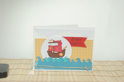
Here is a photo of my project completely unedited. When I started, I took all my pictures with a Kodak Easy Share camera. It took great pictures! A couple of years ago, I got a Nikon D3000 and I LOVE it. It's an entry level DSL, but it works for what I need. . .my project photos and, of course, photos of my family!
When I upload my photos to my computer, I first work in the Windows Live Photo Gallery. That's where I crop, straighten, brighten and sharpen my photos. This is where I weed through the photos and only keep the ones I'm going to finish editing in Photoshop Elements. I will usually end up with a picture of the photo and a closeup of the photo by the time I go into Photoshop. NOTE: I have the full Photoshop, but I've been so used to PSE for so long, I haven't made the switch! LOL
Photoshop Elements is where I fine tune the lighting levels, add my watermark and resize the photo. Sometimes I will add an inner glow to the photo. I just recently changed my process in PSE after I watched/read Joanne's Photo Editing tutorial on Splitcoaststampers. The reason I started using these steps is because I found that sometimes (especially when I would upload a card to SCS as an attachement to a post) the photo wasn't very clear. It somehow became a bit distorted. I have found that Joanne's "Save for the web" step has significantly changed how my photos appear on SCS.
For my project I used the Bon Voyage set from Taylored Expressions along with papers from the Family Ties Paper Collection from Pebbles. I created the waves with the Wave Border Die and the clouds with the Cloud Border Die. The sentiment is stamped on a piece that was die cut using the Banner Stacklets 1.
I hope you've enjoyed a peek into my project photo workflow! Visit the rest of the Baker's Dozen to see how they get their beautiful photos! I know I can't wait to pick up new tips!!
Carole Burrage
Jen Shults
Kerri Mchaud
Lynnette Kauffman
Sankari Wegman
Shannon White
Shelly Mercado
Stephanie Kraft
Tammie Edgerton
Taylor VanBruggen
Wanda Guess
SUPPLIES USED:


6 comments:
Adorable card! I am loving this hop. So many great tips!
Wonderful, Charmaine! Loved seeing and reading about your setup. Your infinity board is very cool and I like the idea of changing up what your project sits on depending on the type of project it is!
Awesome tips, Charmaine! That card is ADORABLE!!!
Such a Fabulous card Charmaine! And I Love your photo set up!! And Super tips too! 8-)
Hugs
Shannon
Darling card with that cutie image and those dotted waves are tooo fun :) Thanks for sharing about your photo set up.
Thanks for sharing your setup, I've never been able to get the Ott light to work for me (too many shadows for me) so it's good to know that it does work! I'll have to keep trying at it! Adorable card too!
Post a Comment